To choose the right color for the room, you first need to get acquainted with the psychology of color. For example, if the interior uses a green color, it will bring a piece of nature to any home. Ambiguity of the color is due, first of all, by mixing the blue (cold) color and the yellow (warm) color. These 2 colors - the color of the sun and the color of the sky, merging together, give life. Therefore, green color is traditionally the color of violent growth and life. If the green color is dominated by a yellow color, then it will cause a person a feeling of excitement. To a person felt a soothing effect, you need to choose a green color with a predominance of a blue hue.
Use in the interior of a juicy green color, as a rule, is associated with grass, tree leaves, with nature in general. Perhaps that's why it acts soothingly to a person and brings pleasant thoughts, and also promotes relaxation. If you use muted green tones, it will help concentration and concentration. Such tones are especially good for decorating the walls of libraries and cabinets.
Modern man, according to scientists, lacks greenflower, especially the population of large cities. In this regard, they are strongly advised to paint the walls and floors in working and living areas in green shades. Green color is very appropriate in those rooms where a person usually rests (bedroom for example). Also, the use of green color will be appropriate in places where people have to work hard, think a lot and concentrate. But in the premises where the active secular life (for example, a living room, a gym) is conducted, it is not recommended to use the green terracotta.
If you take into account all the colors of the rainbow, then the green flower is the most harmonious. Even psychologists say that green color expresses neutralism and pacification, while creating a sense of stability. Still green color relieves muscle tension, is able to appease, and on the heart it is favorable.
If necessary, the color of the grass helps a person to concentrate in order to make the right decision. Therefore, when decorating rooms for employment spiritual practices and meditations are often used is a green color.
Green is very diverse, so some shades of green can not be used everywhere. For example, a bright green color can not be used to decorate large surfaces. For such surfaces, a dark green color is best suited, which is recommended to be accentuated with white, light details. For non-residential premises it is better to use a dark color, in living rooms it will look sullen. To create a more vigorous effect, green color is recommended to be combined with contrasting shades.
It is worth considering that the green color has its own specific difficulties. Green color can perfectly match with many, but it does not combine with all textures and planes. Therefore, for each location you should choose your green color.
For the kitchen, for example, suitable light green shade, which will help to cope with excessive appetite. To create a cozy atmosphere, you need to take a light green shade, with a predominance of yellow, so the kakon improves the mood.
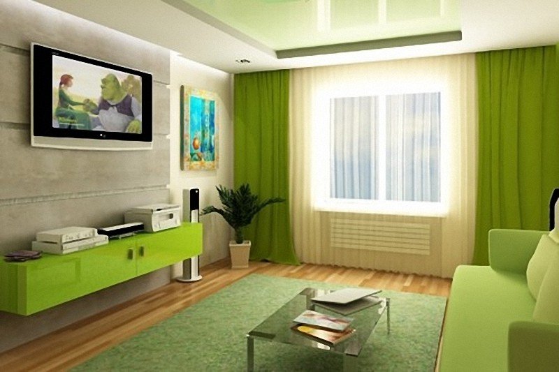
In the living room there will be enough furniture or accessories of green tulle, and the floor and walls are better done in light colors (for example, in white, beige, light blue). Creating such an interior, you can get a laid-back, light atmosphere, in which you can relax or escape from the daily hustle and bustle. Green color, which is used on large surfaces, is able to give the premises an officiality and stiffness, which is why it is not recommended to use it for a home living room.
If the green color is used in the design of the room for the child, then the main thing is not to "overdo it", because from the oversaturation of the green color the child in his room can be bored. Warm green shades can be combined with a sky-blue color or with a bright yellow tint. If the design for children's rooms use orange accessories, then the atmosphere in it will become more festive and bright.
Cold shades of green are ideal for the spouses' bedroom.
Muted, dull gray-green or blue-green walls contribute to calm and relaxation. Good will look velvety body of dark green hue, picked up by satin lilac ribbons, on low bedside tables silver candlesticks, cushions of emerald flowers on a falling coverlet (preferably shiny). Especially it is easy to create an atmosphere of a fresh sea morning or a romantic fairy tale with the help of a green color.
Look at the green one again, especially if you did not like it or you did not even think to use it to create your own interior! The shades of green actually exist a lot, and some of them probably never even seen. Pistachio, turquoise, olive, avocado and aquamarine. And also sponge cake, beryl, Verdepecha and Verdepe, Cowberry, Verdigris, Dragon-green, Heliotrope and Merdua. And also celadon ishartrez, ophitic, moire, praline - and this is not all shades of green. By the way, green color was quite popular in past times, it was given preferences with equal constancy and burghers and kings. The popularity of green color at all times is explained by the following: everyone will necessarily find their own green color, which will transform his room, and sometimes the whole house will give a completely different, harmonious sound.