Red shades will successfully play when used in the interior of the kitchen, diversify the home environment, give a zest and piquancy to the place where people spend a lot of time behind the reception and cooking, talk about life, receive guests. And red color increases appetite, which plays in his favor for use in the kitchen.
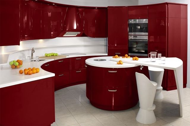
Red is a bright, juicy and passionate color, which leaves little to be indifferent. With the skillful use of red shades in the kitchen can achieve a visual increase in space, as well as give the situation an elegant and expensive look. But you need to adhere to the rule - red color should be appropriate and it should not be too much, because the smaller the kitchen, the less red it should be in it.
For small kitchens it is optimal to combine reds with white, then a tiny space can be visually expanded. To do this, you can use the built-in corner kitchen in red, and the walls and put in white. Or paint one or two walls in red, and leave the rest white, adding a few accessories, such as an apron, towels, tablecloth the same shade as the painted walls.
But here, too, has its own nuances, since the combination of white and red can make the situation too official and more suitable for the office than for cooking and eating. To avoid this, it is better to use warm shades of white - cream, creamy, light beige colors.
It is necessary to combine with red with dark shades, as this interior is more suitable for spacious kitchens, but for tiny rooms such combination of colors does not fit, and will make the kitchen look like a dark room.
In order to avoid mistakes in the use of red color in the interior of the kitchen, you must adhere to several rules:
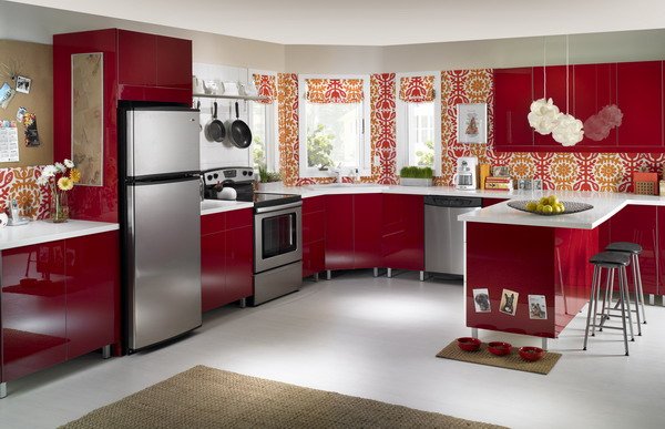
- It is necessary to use accessories in the tone of the main red color, these can be paintings, a vase with flowers or fruits, lace-like ales. Such small accents will revitalize the interior, emphasize the depth of color.
- It must be remembered that the red color makes the bright furniture more vivid and aggressive, and the tender one is still gentler and lighter. It turns out that if the furniture, then it's better to limit the wallpaper to the red elements, and the walls and pour light colors. If the furniture is light, then the red can be used in larger quantities.
- Some prefer a combination of red and black, which can make the kitchen a dark and gloomy cage. But if you really want, then you can combine these colors in curtains for the kitchen or chandelier.
- The combination of red with dark shades is excellent for a kitchen connected to the living room, this will distinguish between the rest area and the reception area with the cooking area, but it will not suit a closed kitchen with a small space.
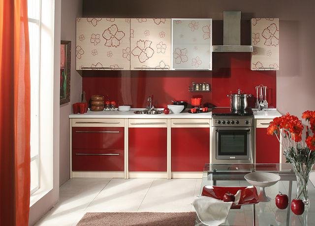
- You need to think in advance about what color the red will combine in the kitchen, the classic option is a combination of red with warm lighter shades (creamy, beige, cream, coffee with milk). But you can experiment and connect red with lemon, green or blue flowers, but this unusual idea is risky enough and you need to stick to the measure, otherwise the kitchen will turn into a standard of bad taste.
- It is necessary to avoid the use of complex drawings and abstractions, which will divert attention from the main task - cooking and eating.
Red color is able to revitalize the interior of any kitchen, expand its boundaries, focus on its merits and hide the shortcomings, give a holiday atmosphere. This shade will look like it is, when used in small quantities, for example, in various accessories, curtains, chandeliers, and in a larger scale version.
But again, one must adhere to one's own tastes and internal preferences, since the red color in some people causes a feeling of exaggerated fatigue, irritability. In others, on the contrary, it increases mood and charges with a positive.