With the advent of spring, nature revives, the sun more often peeps into the room and illuminates the familiar interior. And how you want something new, fresh, springy, pleasing to the eye! It's time to remember the powerful design tool - COLOR.
The world is diverse and multicolored, but we often forget about it, limiting our imagination to five or six colors. But with the help of color you can change your mood, adjust the unsuccessful form of the room and even ... influence fate (if you believe Chinese art feng shui). A small detail of contrasting color can revitalize the everyday interior.
Characteristics of primary colors
Colors are warm, cold and achromatic (white, black and all shades of gray). Warm colors (from yellow to crimson) lift the mood and tone. Cold soothe.
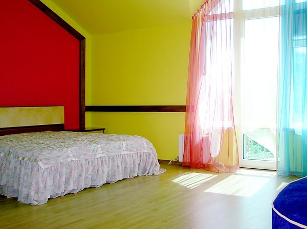
Red is the color of strength, vital energy, and at the same time, some are perceived as a danger, so it's easy for excitable and quick-tempered people not to get involved in red in the interior.
Yellow lifts the mood, activates the intellect. This color is pleasant to people vigorous, loving to communicate, to travel.
Orange improves appetite, promotes enthusiasm and creative inspiration.
Green - the most "natural" color, it causes a sense of stability and peace.
Blue calms and creates a feeling of coolness. Promotes a free flight of thought. Purple attracts philosophers and dreamy natures.
Brown - the color of the earth, suitable for people who care for their roots.
White visually expands the space and allows decorating the interior with bright colored details.
Black attracts its depth and mystery.
Where does the color design of the house begin?
With the choice of color for large planes (walls, ceiling, doors, etc.).
The standard color scheme is a white ceiling and all four walls in a room of the same color. This option is still relevant, because it allows to emphasize the advantages of the room. But today, designers use other methods of design, each of which is attractive in its own way. If the room is too low, you can paint the ceiling and walls in the same light color (for example, white or lemon). Then it will seem higher. And you can, for example, paint the walls with vertical stripes. Visually increase the height of help and painting on the ceiling. But do not depict something on the low ceiling of a monumental, but clouds, soft flowers or birds are quite appropriate.
For visual expansion of space, it is best to use light shades of cool colors (blue, light green, etc.). Wallpaper with a large pattern reduces the space, and with a small - increase. If you want to create a sense of spaciousness, choose light colors for the floor. Draw attention to the windows (bright colors of frames and window-sills, bright light curtains). You can hang mirrors (but avoid massive dark frames for them).
Color matching for different functional areas
The children's room is appropriate light, warm and moderately bright colors. But if your child is too excited and active, it will not hurt to add a blue and green color. But red in the nursery is undesirable in large quantities. It is useful to update the interior of the nursery at least once every two to three years, because the child is growing and developing. You can change the color scheme, but not too abruptly.
The bathroom looks good both traditional white, and various shades of blue. Recently, silver color is popular. If the bathroom is relatively spacious and well lit, you can make the main color emerald or cowberry. Light plumbing can "start" on a dark background.
The kitchen and dining room allow you to use both bright warm colors, and cold and muted - depending on what kind of effect you are striving to achieve. If you want ease, then it is appropriate yellow-orange terracotta. And for noble peace - at your service are various shades of green or the color of natural wood. Pleasure eye small details of white or golden color. If you are striving for full transparency, you can make a white kitchen.
The bedroom is a kingdom of soft colors. If you dream of a meeting with a companion of life, then you will like a bedroom in peach or light pink tones. In any case, avoid large volumes of red, bright yellow and bright orange (otherwise it will be difficult to fall asleep), black and dark blue, dark purple and dark brown, and also dark gray (to avoid depression).
The living room gives much more opportunities for bold color solutions - from purple with gold to the African scale or acid colors. But remember that overly bright, aggressive colors tire vision and psyche. And, probably, after a while you will want to repaint the living room into something more peaceful.
The office is traditionally painted in cool cool colors. Although if you want something more vivid and it does not distract you from work - please! Someone needs a cabinet in white and blue tones, someone - in golden brown, and someone - and in pink.
Practical recommendations for those who create the color solution of the apartment
First you need to choose a style that implies a certain color scheme option. So, the ethnic interior is built on the basis of other color combinations, rather than a classic or high-tech. Try to imagine what the overall feeling of your interior should be (warm, soothing, energizing, luxurious, ultra-modern, etc.).
Further:
- Draw a plan for your apartment.
- Take any paint to paint and embody on paper several color options. Start with the overall color composition of the interior, and then draw the sketches of each room separately.
- Choose the most suitable options for you.
- Take pieces of cardboard or heavy paper and paint in the colors you select. You will get a design layout of the color solution. It can be made volumetric or flat. Note that the colors should be looked at both natural, and with artificial lighting, and at a distance of at least 2 m (near the perception of color changes).
- If everything suits you, postpone the layout for a week, and then take a fresh look. Talk to your household. Perhaps your child dreams of a different color room, and her mother-in-law does not want to see an orange kitchen.
- When the final version is approved, go buy paint. Benefit now you can buy a paint of almost any shade.
Paints (depending on the base used) are divided into alkyd, glue, silicate and emulsion.
Oil paints are sensitive to sunlight, therefore, they are not suitable for painting houses outside and rooms that are heavily illuminated by the sun.
Enamel paints are usually used for plaster, wooden and metal surfaces.
Adhesive paints are similar in properties to emulsion paints, but unlike them are not resistant to moisture and are suitable for dry rooms.
Silicate paints produce on the basis of liquid glass. Properties such as air permeability, resistance to dampness and sharp temperature changes allow them to be used for finishing stone, concrete, plastered surfaces both indoors and outdoors.
Emulsion paints include acrylic, water-emulsion and water dispersion.
Water-dispersion paints are a modern version of paints created about 50 years ago. These paints do not need a solvent, they are diluted with water. Their chemical structure allows the painted surface to "breathe", which positively affects the microclimate of the room. The advantages of such paints include rapid drying.
Acrylic paints today are one of the most popular and popular paints in the world, since they do not contain solvents, they can easily be washed off with water (until dry), quickly dry out, do not fear ultraviolet, are resistant to chemical and physical influences, the color persists for many years.
The choice of paint depends on the particular room and the complexity of the work. Here the principle "seven times measure, once cut" operates. We recommend that you first paint a small piece of the surface and see if the test shade matches the one you want. In this case, the texture of the wall, the prevailing type of lighting, and much more can play a role. Achieve a 100-percent color match with the desired is not easy, but real.
Choice of furniture colors
So, the walls are painted. The next stage of the color decision is the choice of furniture. Here it should be noted that light furniture looks better on a light background, and cumbersome visually reduces the size of the room.
The style of furniture must match the general style of the interior.
If you have a room painted in bright colors, furniture can be more relaxed, and vice versa: bright color spots are in harmony with the neutral background. That is, in a room with red walls, a yellow or red sofa can be an excess.
The same rule applies to other bright accessories (curtains, carpets, paintings, works of arts and crafts). Excessive diversity is permissible only in the ethnic interior (and then within reasonable limits).
And finally, aerobatics - the interior ... in one color. For example, the whole room is decorated in different shades of green. A similar option may be interesting, but it requires an irreproachable taste. If you want to create a similar interior - avoid gray, black and red.
In the end, we note that the color of the interior is a matter of taste and psychological comfort of the dweller, one of the ways to express one's individuality. In addition, the symbolism of color varies in different countries and in different epochs. In short, if you are comfortable in a red bedroom or a black bathroom, paint the way you want. Because the interior is for you, not you for it. Modern design is individual. The highest value is still not the fashion and style, but the good mood of the owner of the house. So different colors of your life!