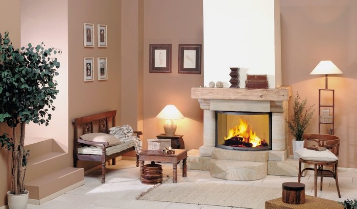
The choice of the situation is necessary so that its objects are in harmony with each other, consistent in color. It is not necessary that the furniture was a single headset - the main thing is that it be matched with taste.
In an apartment there should be nothing superfluous, artsy, provocative. By furnishing an apartment, creating its interior, one must strive to ensure that it not only satisfies the various needs of people living in it, but it was also a desired and favorite place for them.
To do this, it is necessary to rationally use the area of the apartment, it should not be cluttered with furniture, carpets - from this it becomes narrower, darker, there will be more dust in it, harmful household insects can start. The arrangement of furniture should be such that the apartment was comfortable, and the rooms seemed spacious, bright, comfortable. For a small apartment you should buy furniture of small sizes, better combined. You need to think carefully about the design of the interior, taking into account the location of rooms and other premises in relation to parts of the world.
When choosing the color of the walls, it is necessary to take into account the orientation of the windows, the purpose of the rooms, their dimensions, illumination, the situation, the composition of the family.
It should be borne in mind that different colors affect the mood of a person differently, affect the nervous system.
Wallpaper, painting walls in rooms should not be too bright, bothersome. Wallpapers with bright colors tire eyes, quickly bother.
Purple and red colors act on the nervous system excitingly, reduce efficiency, contribute to fatigue. In living rooms, it is better not to use such colors.
The yellow color has a calming effect on the nerves, it is the color of a good mood.
Green and blue colors also soothe, increase working capacity.
The color of the walls can visually increase the volume of the room, reduce or increase the height of the rooms.
The walls of light cold tones (soft blue, bluish-green) seem to recede, and warm tones (red, orange, yellow) visually approach the walls. A small room is better covered with wallpaper with a calm fine pattern on a light background, wallpaper with vertical stripes visually increase the height of the room, with horizontal - reduce their height.
In living rooms it is better to use colors that help to calm the nervous system, do not tire vision, increase efficiency. It's green and blue and their warm shades.
Warm colors in the interior decoration of the apartment are cozy and cheerful, and the cold ones are calm and strict.
For rooms of southern orientation, cool colors are preferred - green, green-blue, blue. For rooms oriented to the north and north-east, golden or pinkish-yellow tones.
In the bedrooms are preferred calm warm colors: (golden yellow, pink-cream), for common rooms - more strict tones.
Coverlets and curtains should be in harmony with the main color background of the interior. Curtains are selected in tone with a touch of wood furniture and its upholstery fabric. Their width should be 2.5 times the width of the window, then the folds on the curtains will be deep, beautiful.
Curtains protect from the sun and street light. If the window seat is free, choose long curtains.
Colors for fabrics for curtains are different. In the bedroom or study, a plain or soft fabric with a barely noticeable pattern is good, in a common room there is a cloth with a large pattern, for children - bright with a children's thematic pattern.
Contrast fabrics with a pattern of transverse stripes push the walls wide, fabrics with vertical stripes make the room high.
Calico or staple fabrics with a printed or floral ornamental pattern can be used for curtains in any room, depending on the scale of the pattern. In a small room, curtains with a light large pattern will look annoying. If the fabric has a large, but light colored pattern, then even in a small room it will not be sharp.
In the kitchen, you should not paint the walls in bright, red tones, "under the brick", glue with an oilcloth, especially with a motley pattern, it is better to paint walls in light, calm colors with a matte oil paint: grayish, greenish, yellowish. background.
For the front, cleaner and more intense colors are preferred.
If the room has many paintings, wall decorations, it is better to use soft neutral tones. For glass, crystal, mirrors are more sophisticated, deeper colors.
For better perception of the picture on the wall should be placed so that the center of all the pictures was at an altitude of about 150 centimeters from the floor level. If the pictures are placed in several rows, then in this case the horizontal line of symmetry of the pictures should pass at a height of 150 centimeters from the floor.
Pictures should fit in the interior, it is good to combine with other pictures, ornaments and furnishings. The size of the picture must match the size of the wall. For example, a small picture on a large wall will not "look", and a large picture on a small wall is too striking.
Very adorn, revive and ennoble the interior of a variety of selected ornaments: decorative plates, chasing, Khokhloma, Palekh products, ceramics, seashells, sculptures, etc.
Decorative decorations should be in harmony with the basic color tone of the room. The room should be no more than 3-4 colors. You can not oversaturate the interior decorations. Excessive number of ornaments, ill-considered accommodation create a sense of confusion and neglect.
The situation in the house can say a lot about the level of the culture of the owners, their taste.
Remember! Even if the apartment is well and tastefully furnished, but in it stagnant air, unpleasant smells, etc., all its beauty fades.