Gray color is considered neutral color. It fits well with many colors. But despite this, few people decide to use it in the interior. There are many reasons for this. Some believe that this color is too boring and tiring. However, gray has one major advantage - it can give shades to other colors.
Only in gray tones the rooms are made very rarely-it's an amateur. Most often, designers combine gray with other shades. It should be noted that many color combinations have their own nuances.
Interior in gray tones
As already mentioned above, the rare man uses only a gray color in the interior. Most often, the customer and the designer consider this interior dull and boring. But lovers of neutral colors can consider such an arrangement elegant and concise. It is worth noting that a very often gray color is selected as the base color. Most often this design solution is used in modern styles.
For example, quite popular minimalism and ecological minimalism allows to harmoniously use gray color in the interior. For this style of design designers are choosing natural shades of gray - that is, those colors that occur in nature. Rain clouds, palate kidneys, cloudy sky - it's all painted color.
In addition, very often gray color is used in the style of techno, loft or high-tech. In these styles, as a rule, industrial shades are used: chrome, metallic, concrete, wet asphalt, gray brick. However, no matter how dominant the gray color in the interior, it is diluted with other colors. Most often use classic white and black colors, as well as the color of coffee, cocoa, vanilla, caramel, milk, walnut and the like.
Traditional combinations of gray in the interior
If it comes to the gray color of the home, it is used as a basic or dominant color. Most often, the speed of individual elements of the interior can be compensated for by the texture of the materials. Therefore, if you decide to use gray color, do not forget to add something to the interior with fluffy, rough, piley surfaces and natural shades of gray. Most designers use classic color combinations with others:
- Combination of gray with white;
- The combination of gray with the color of a natural light oak;
- The combination of gray and violet;
- The combination of gray and pink colors;
- The combination of gray and turquoise colors;
- The combination of gray and orange (yellow) color;
- The combination of gray and blue (blue) colors.
The combination of gray with white is always a win-win option. Also traditional is the combination of the evening, white and black colors. If you want to decorate your interior with an investment style, you can use a combination of gray with cream color, yellow, blue, brown and other pastel colors. For a kitchen interior, a combination of gray with blue or blue or bright yellow and orange is most appropriate. Milky blue and gray - an excellent combination of colors for vintage style. However, in this case it is necessary to choose the gray color of pearly, ashy or greenish shades. Designers call such a shade of antiques. The most successful variant of the texture of the material for the vintage color is crushed silk.
In the bedroom, the most successful combination is a combination of gray with turquoise or the so-called boudoir palette: cocoa, bardo, muted crimson, pastel violet. Recently, many people often use for the bedroom a combination of gray with a rich purple, flickering lilac or bright pink. But this combination is best suited for glamorous styles. In this case, you need to choose gray mother of pearl and shiny textures that have bright shades of violet and pink.
In industrial styles, designers often combine a rough texture of gray with gentle glamorous shades. The loft gray color is used as a supplement (in the form of concrete brick masonry tiles) or background. But such styles, as a rule, are chosen only by creative people who are not used to stereotypes.
Innovative combination of gray color
Today it became very fashionable to decorate the interior with not just deep and bright colors, but more and more designers use acidic and flashy colors. As you know, bright colors are best combined with neutral colors. Therefore, gray is suitable here as not by the way. Most often, designers use this technique when developing projects for a kitchen. Gray textiles and walls are well muted by the flashy effect of bright yellow, red, orange or orange colors, which is often used in modern kitchen sets.
The Scandinavian style is also very popular in our country - a combination of gray with bright green and white. And in this case, the ratio of colors can be absolutely different: white and green walls in combination with gray furniture or the floor, or zeserye walls in combination with bright furniture.
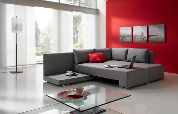
Another fashion trend is bright orange accents in the gray interior of the living room. Most often in such cases, designers select textiles, furniture or decor elements of a saturated or orange color and combine them with gray walls, ceilings and so on.
Gray furniture is best combined with bright ceilings and walls. This combination is most often used for the formalization of the dining room. In this case, designers prefer to use warm shades of coral or red, orange and pistachio. Oftenuse another combination: a combination of gray with burgundy and cherry.
Functionality of gray color
Gray color affects not only our mood, but also the overall atmosphere of the house. This color can make the interior cozy and elegant, refine it and visually enlarge the room, make it more spacious.
A universal solution for any room will be a combination of gray and white. To add sophistication, you can dilute these colors in red, orange or bright green. In addition, such a design solution will never go out of fashion.
The combination of different shades of gray color will help add a room of rigor. This combination will be harmonious in the interior of the bedroom, office or home cabinet. Variation with shades of gray will help add room volume and depth. For rooms in which the windows face south, it is best to use cold shades of gray. But for the interior of the northern rooms, a light and warm shade of gray - gray-beige, silver-pink, gray and olive - is suitable. To give the room a cosiness, it is necessary to decorate with contrasting furniture.
At first glance it may seem that the gray color is easy enough to use in the design of the room. But in fact it is not. With gray it is necessary to handle very carefully. If it is misused, the room will appear unconstrained and uncomfortable. To avoid this error, adhere to a simple rule - combining gray with other colors in your interior, always match the same shades - either warm or cold. If you want to use additional color shades, then choose shades of the opposite color scheme.