In the color wheel
To correctly choose in the interior of a combination of colors, it is desirable to know the basics of color theory. Primary colors are known - yellow, blue, red. These colors are originally found in nature and, most likely, that's why they serve as the basis for other colors. If you mix these colors, you get the second color - green, purple and orange. Thanks to the further mixing of the main and secondary colors, new colors, or more precisely, six colors, are obtained. Having arranged these colors in a certain order, you can get a color circle from twelve color sectors. It is worth noting that in each individual color sector with color you can experiment almost endlessly, getting more and more new shades, adding black and white colors to the color in different ratios.
In the color circle, all colors are divided into 2 groups - cold and warm. Warm colors are shades from yellow to red-violet yalogo. Cold colors are usually called shades from purple to green with shades of yellow.
Warm colors are often called approximations, since the surfaces painted in these colors visually appear closer than at the bottom. Cold colors, respectively, are called removing, because the painted room looks more spacious.
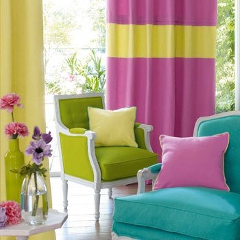
The color wheel helps to easily create a combination of colors. Neighboring colors, as well as close colors are considered harmonious, moreover, they act soothingly. However, an academically correctly chosen color solution will look monotonous and boring. The most ideal combination is a harmonious base with the addition of contrasting strokes of reasonable quantities.
There is another method - to use paints, in which there are several monocycles with each other not mixed (multicolor colors). These colors can create a smooth combination of colors. For example, selecting the color of the walls for furniture, a set of monocolors includes the color of furniture and shades, harmonizing with the furniture set. This makes it possible to choose for stentaca a color that does not merge, but does not contrast with the general situation.
Thanks to modern materials, it is possible to create textured surfaces. The textured surface is an impregnation of small droplets, which are usually painted in different colors. Such colors are considered a universal background, as a rule, in such a background different decorative elements of the interior fit well.
Choose a color
The choice of the color palette is usually affected by the function of the room.
For example, if the living room in a manor house serves as a permanent place for a large family, it is better for her to choose those colors that contribute to a relaxed environment, relaxation and a good mood. In this case, golden, gray-blue, yellow-green, gray-green colors (ideally will harmonize the colors from small to medium saturation) are ideal.
If the living room in the mansion or cottage serves usually for rest in the evenings and / or reception of guests, a good color solution will be a saturated tone that promotes the festive mood. For example, such colors are blue, purple and purple.
A bedroom is a place for rest, in which there must be an atmosphere of tranquility. For this premise the warm yellow tones and the chilly blue are the most suitable. If the bedroom is also a working space, then prefer a light gray-blue shade or a gray-green one (in general, you can use any neutral colors) that promote mental employment and focused work.
All children like bright saturated colors. However, for children it is better not to use, because they strongly affect the psyche and tire the child. For children it is better to take muffled tones - white, light green, blue, gray, ocherous. In the interior of the children's room, you can include bright furniture, furniture, bedspreads.
If the room is intended for the elderly, then the color gamma should be in calm tones without sharp contrasts. Give preference to green, gray, calm brown and beige tones. The same colors can be used for the cabinet.
Hall in most cases suffers from lack of daylight, so it is better to use a light color palette for this room. It is also better to take light colors for the hallway. If the walls of the hallway are covered with boards, it is recommended to preserve the natural shade of wood.
The kitchen is best painted in a bleached blue color isine-green. These colors give the impression of coolness and spaciousness. In the event that the kitchen is combined with the dining room, then green and blue colors are recommended. Kitchen equipment and furniture of light tones at the same time will shade the darkphone, so that the room will look visually elegant. In the furnishing of kitchens, wood is often used. Light boards on the walls, good to be combined with wooden kitchen furniture, dining room and decorative utensils, bright dishes, kitchen accessories made of colored plastic.
The most modest size in the room always has a bathroom. For this room will fit clean, diluted colors - blue, turquoise, lilac, pink. In such a room, the glazed tiles of rich red, blue and black colors will look extravagant.